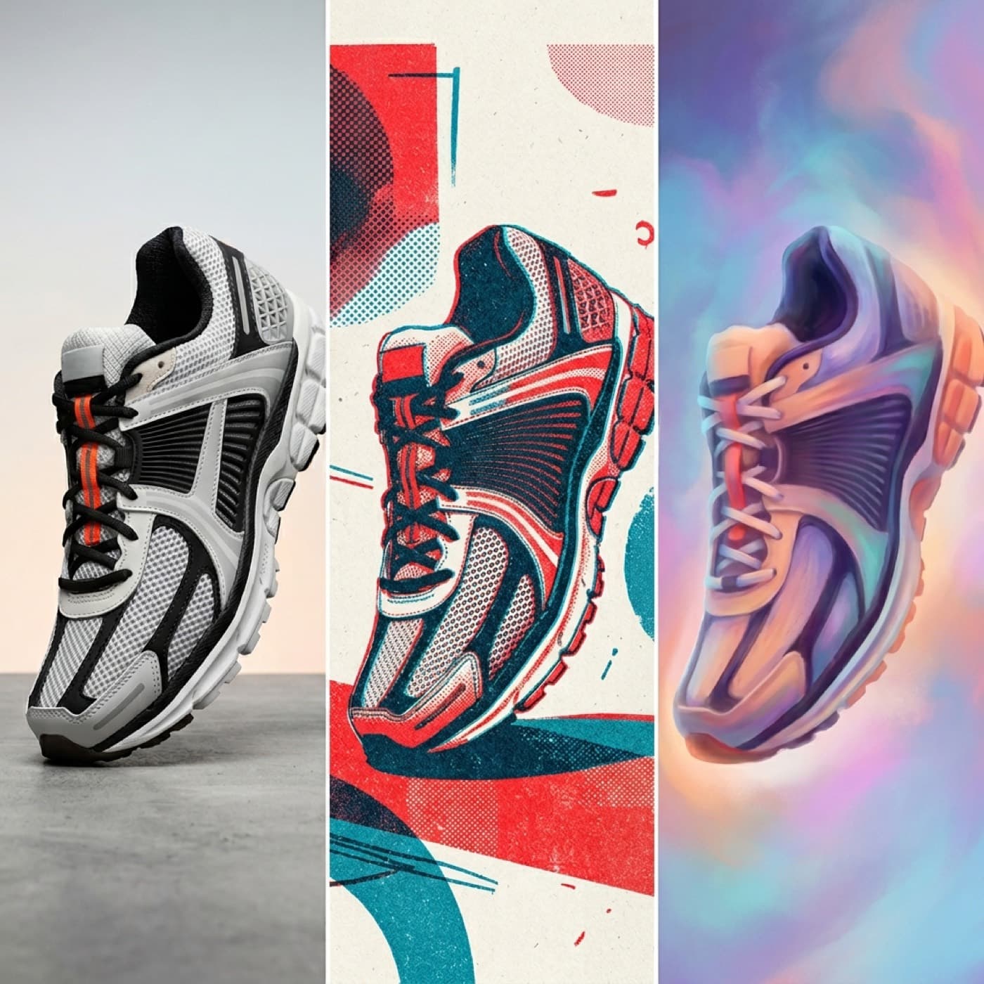
Compare Flux, Ideogram and Midjourney against the work your brand actually needs. An attractive sample is not enough if the product, text or subsequent revisions fail.
Separate three image tasks
A product image must preserve the item's identity. A text-heavy ad needs accurate, legible typography. An atmospheric image must fit the brand and intended crop. One successful example cannot establish which model handles all three best.
Run separate trials for different needs. Use the same brief and approved references, while allowing the producer to use the features available in the selected version. Identical prompt wording does not always provide a fair comparison of complete workflows.
Start with difficult product details
Choose a SKU with distinctive packaging, a recognisable surface or a particular shape. List the details that must remain intact and check every image against them. A changed logo or an incorrect joint is still a defect in a beautiful composition.
Record the time needed to reach an approved image, including rejected attempts and manual editing. A selected final file shows what is possible, but says less about how reliably or practically it can be produced.
A hypothetical ad with text
Imagine a skincare brand showing its packaging beside a short headline. Separate the product, background and copy. You can test generating the whole composition, or add the approved headline in an editor afterwards.
Compare the finished result and the effort involved. If the copy will change across languages, editable typography may matter more than generating the entire poster at once. Check that a correct headline has not distracted reviewers from a changed label on the product itself. This is a trial design, not a measured model result.